Saturday, 5 November 2011
Coming to an end...
I am now writing my evaluation for this project, and I can honestly say I much prefer the making to the writing about the making! I have really enjoyed this project, and will defiantly carry on using the skills I have learnt.
Friday, 4 November 2011
Owl Owl Owl Turtle
Now that I am starting to understand colour I am really enjoying it! And the project is almost finished which is just typical!
These images below I made using scans of mono prints and again putting them as a layer behind my line work in photoshop. My mono print was originally dark blue and yellow, but I played about with the colours in the hue and saturation drop down in photoshop. I think it's quite nice to come away from the traditional colours used for an owl. I saw the blue and purple and thought it worked well with the owls face blue, making the stare seem even colder, like stone.
I added another mono print layer to the turtle in the image below. I don't really like this though, I don't think it's very balanced as a whole image. There defiantly needs to be more colour somewhere but I need to play about with where it should be.
The image below is my final and favourite. I did want their to be colour on the bottom part of the image, but instead of adding the mono print to the turtle I added it to the background and then faded it out to the top of the picture. I think this works, the balance of white in the image works better like this because it is at both the top and the bottom (the turtle)
Angry Owl
I decided to use some of the mono prints that I am not going to hand into my elective and work into them further. I scanned this mono print onto my computer. I changed the levels so that it was much darker, I want to create a feel of autumn and anger with my colours of this image. I placed my other image from before where I drew an owl over a turtle. I removed the turtle and placed the owl so it appeared to be on the branch of the print. I added some colour to a layer between my background and my line work so that the owl stands forwards of the dark background. I then just played about with colours and added some lines to the branches of the tree so that the foreground and background didn't seem to separate.
I am really happy with this image, and although it hasn't all been made in the print room I think it's quite nice to use lots of different processes and gather them all together in photoshop. It seems like a useful middle ground!
I am really happy with this image, and although it hasn't all been made in the print room I think it's quite nice to use lots of different processes and gather them all together in photoshop. It seems like a useful middle ground!
The image above is that same as the first image, but I have hidden all line work. I quite like that the image is reliant on just shape (which is something I NEVER do!). I'm not sure if I like it just because I understand that the bright yellow marks are supposed to be staring eyes, it might not be as clear to other people that it is a pissed off owl on a branch where the leaves are falling off.
Tuesday, 1 November 2011
OBSESSED!
This project has made me realise something, that I partially already knew, but this brief has confirmed it for me. I am a very obsessive learner. Ridiculously so.
When I researched about Iain McArthur I became obsessed and this began to influence my work and change the way I consider my lines when I draw them. And now with the print room! I have always loved the print room but I really really think that print it the way that I want to take my work. Even if I am just using elements of print to create bigger images. I just love the process and finished product of a good print.
Working in print has made me change the way that I think about making an image. When working with Lino you really have to think about areas of light and dark before thinking about areas of colours. When working with screen print I find it good to have both delicate line work and some looser shapes and areas that don't necessarily matter if they align differently each time.
After this project I really want to develop my work both in the print room and with colour and line work. I'm starting to get really excited with the work that I am creating :D
Thursday, 27 October 2011
Reading Week - Day 4
Today I got to do so much stuff concerning colour, and it's so annoying that none of it can be used here!!!!
But thats ok because I have learnt lots of new skills for printing with colour.
I have learnt that when trying to mix the ink used for Lino and Mono you really need to consider the colour and shade that you want. Start from the lightest colour and adding tiny parts of darker ones. Mixing the inks themselves takes a long time, and to mix them you have to use a specific technique. Instead of just getting a white and adding blue and mixing you have the put the inks on the table and use a spatular to scrape the colours into each other. It is hard to explain but the technicians in the print room are always around to help! I got too impatient with my colour mixing and rolled the colour out with the roller before it was consistent, meaning that some of my prints are slightly blotchy.
I also got the opportunity to screen print over many different colours of paper today to see how the ink transfers. I was using white paint, which i mixed at 50% with the binder, making it more opaque than normal but meaning I have to print fast so the screen doesn't dry out. Sarah said that white never goes over darker colours too well, but this made my prints quite interesting. The white was going over the paper colours and picking up tints of the colour, so when printing on black the white paint appeared a really light blue.
Towards the end of the day I started to layer different print processes onto of each other. Combining Lino with screen printing in many different layers, which was really successful. And I then tried to combine etching with both drypoint and mono, these failed quite amusingly! But this means that I can use the mono and drypoint backgrounds that I used for other images :)
Wednesday, 26 October 2011
Reading Week - Day 3
Today I made some screen prints in a four colour separation as I was making my Lino. A few weeks ago when in the print room I realised that making work is so much more efficient when you have something to do as a filler task, other wise too much time is wasted on waiting. I applied this work ethic to today, I knew that waiting for my screens to dry and waiting for the printing beds to be available would take a while, so I continued cutting the layers of the lino when waiting.
I decided to make a screen with four colour separation so that it would help me understand colour slightly better. I learnt much more than I originally thought I was going to!
First off when making a print with a four colour separation you need to mix the inks, but perfectly. I normally guess the levels of ink and binder when preparing my colours. With a four colour separation you can't do this, all four colours need to be of the same level so that they can perfectly sit over the top of one another. You need 50g of system 3 acrylic paint (in cyan, magenta, yellow and black) and 100g of binder. This should make up a whole pot of ink. I managed to make much less that this at first because the scales were set to pounds! But we worked it out and no ink was wasted :)
Above is a small section of one of my prints that went wrong because it wasn't aligned correctly. I am not going to use it for my print elective because of this but it is a really good example of how the ink lay over each other to make different colours.
Tuesday, 25 October 2011
Reading Week - Day 2
Today I worked lots with Lino. I have made a Lino that is made out of 3 different pieces so that I can ink each piece of the plate up with separate colours. I can't show any of the images that I make from this print process but I can show the plate it self.
The problems that I had with this process were; cutting the lino itself, placing it all together for printing, and registration.
The Lino is really really thick and has a gauze backing beneath it. Cutting through the lino is fine but trying to get through the gauze was near impossible, my whole right arm went numb trying to cut it! Thankfully Neil came and helped me with the rest of the tricky bits!
I also had lots of problems when trying to place the three separate plates back together once they were inked up. You can't touch the surface because you were create imperfections in the ink, but plates don't fit back together as perfectly as they had come apart. I ended up having to shave small parts of the bird layer away so that it would fit easily into the middle. Even then I had to use a small spiked took to push the plates into place (as long as you put the took in a part of the lino that you have cut away it won't mark the print!)
Then Finally when I came to layer the images up I found even more problems. The nipping press that I used moves the sheets of paper! So even if you line it up it moves, so you have to be really really protective of the placement of the paper right up until it is under the press and ready to be pressed.
This is my lino in it's final stages of cut, the owl is nearly all cut away.
The problems that I had with this process were; cutting the lino itself, placing it all together for printing, and registration.
The Lino is really really thick and has a gauze backing beneath it. Cutting through the lino is fine but trying to get through the gauze was near impossible, my whole right arm went numb trying to cut it! Thankfully Neil came and helped me with the rest of the tricky bits!
I also had lots of problems when trying to place the three separate plates back together once they were inked up. You can't touch the surface because you were create imperfections in the ink, but plates don't fit back together as perfectly as they had come apart. I ended up having to shave small parts of the bird layer away so that it would fit easily into the middle. Even then I had to use a small spiked took to push the plates into place (as long as you put the took in a part of the lino that you have cut away it won't mark the print!)
Then Finally when I came to layer the images up I found even more problems. The nipping press that I used moves the sheets of paper! So even if you line it up it moves, so you have to be really really protective of the placement of the paper right up until it is under the press and ready to be pressed.
Monday, 24 October 2011
Reading Week- Day 1
I started my print room elective today, the elective itself runs from this Monday till Thursday 9 till 5 each day. Although I can't include any of the work I make over the the week in my Comm Tech project, I am still going to work on colour, and how I can include colour in my work.
So today we just quickly went over most of the print processes that are available. I have done all of these print processes before this induction but I learnt some really useful things.
In Etching
On the 19th of Oct I posted my A4 etching plate that I made. I had said that the reason that my plate didn't come out very even was because I didn't leave it to aquatint for long enough. I found out today that that isn't the reason. It could be one of three things;
- There could of been an oily residue left of the plate when spraying the clay acrylic onto it.
- I could of blotted the plate dry too vigorously between stages and actually removed the clay layer.
- Or when the spray was put on the plate initially it could of been sprayed on unevenly (I didn't spray it myself, and Neil in the print room reckons it might be this reason. So next time I know to do it myself!)
In Drypoint
Before when I have used drypoint it has really wound me up that you can't make perfect lines. Cutting through the plastic with a sharp object creates a really jagged and uneven line. I realised today that this can be a good thing, instead of trying really hard to make it perfect I made my lines really quickly so that they deliberately became uneven. This worked really well to create a tree background that I can then work into later!
Friday, 21 October 2011
I don't even want to put this horrific attempt on my blog!
I thought I would try and add some colour to my 'The Woman' picture. I did this but putting some thin paper over the top of my original outlined image (i'm too scared of ruining my first drawing). I thought I would scan in both the colour layer and the outline that way I can play about on photoshop with the colour more, and it means I have more than one go at not ruining my work!
This is the rough colourful mess I made with chalk pastels. I wanted to pick up lots of texture.
Here's the chalk layer with the outline over the top, I set the outlined layer to 'multiply' on photoshop so that all the white disappears, literally making it just an outline on top of my background. Doesn't make it look good though! This is horrific and I hate it! The chalk pastels on their own are too vibrant and there are too many bright colours in this now. I think it would be better if the whole image was murkier and darker.
Here is my next attempt. For this one I just made another layer in photoshop and put a murky green shade over the whole later, I set the opacity to about 30% so that you could still see some of the detail of the background. To the background layer I used the colour burn tool to darken up some of the shades in the trees and in certain parts of the water and the woman. Doing this brought loads of textures out which I quite like. I also added a bit more line work over the trees, I'm not sure if this is actually needed though.
I decided what was annoying me about the top images is that they were just too busy. My line work is quite detailed so I don't think the background needs to be as detailed. In this image I made the green layers opacity up past 50%, I then just painted some rough shades over it. You can still see some of the texture from the background which I like. I also added small amounts of shading to the woman, I just wanted her to pop out of the image a bit more so I added some highlights.
This is my latest version of this image. For this one I made my original pastel background greyscale so that only the textures would be picked up, I decided that the colours that were coming through form it were still too varies and too bright. I did as I had done before and put a flat layer of green over the top. Then I started working into the background with the burn tool in shades of green and red. I really like the textures that are coming from this one. I made a whole new layer to colour the woman on this drawing because I thought she should stand out more from her background. I made her a yellowish green so show that she was dirty and not quite right. I added the highlights again and shades of red and brown to work along side the theme of horror and blood.
Honeslty I don't really like any of these pictures. I do like the combination of using found materials and textures and taking them into photoshop to make them do what you want them to though.
The Woman
I read this competition brief the other day and started making some artwork for it.
Can you design a unique new illustration or poster for Lucky McKee’s THE WOMAN?
If you think you have what it takes to produce a work of art that will speak to Horror and Cult audiences, then this competition is for you. Your entry must embody some characteristic from the film or book by Jack Ketchum and Lucky McKee.
I wasn't going to include this in my comm tech at first, but I think the image I have made would be a good image to experiment with some colour!
This is my original line drawing
The colour ideas that I had for this image were quite murky, maybe combinations of greens and reds. As it is an illustration aimed at people that love horror it should be quite a dark and gloomy image.
Thursday, 20 October 2011
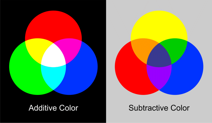
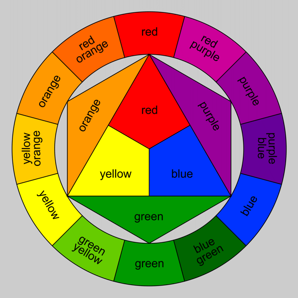
Colour Theory
Colour as symbol
Obviously these are all generalisations, they can depend on different countries and cultures.
Colour as emotion
 |
Red through its association with fire and blood is used to represent danger, anger and violence. For the same reason it is also associated with affairs of the heart: love and passion.
| |
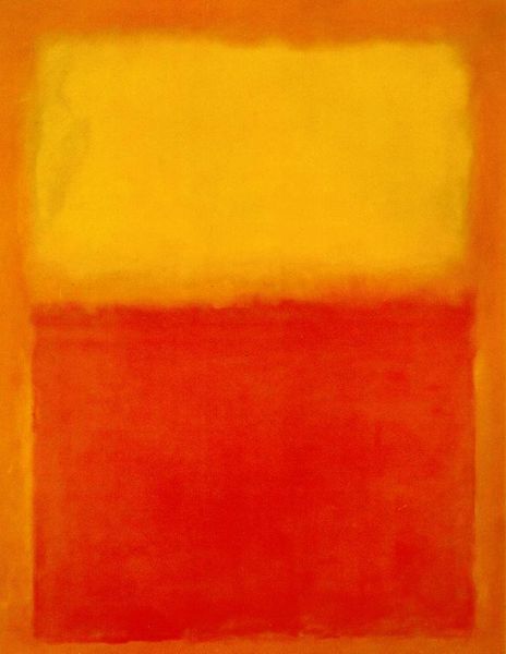 |
Orange symbolises creativity and endurance. As a secondary color it combines elements of the colors used to mix it. It unites the creative passion of red with the clarity and wisdom of yellow.
| |
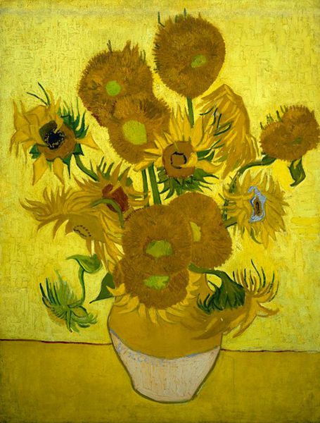 |
Yellow is the color of the sun - the life support for our planet. As such it has come to represent life, energy, happiness, hope and wisdom.
| |
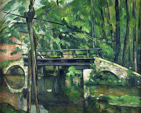 |
Green, as the color of plants and grass, is the color of nature and all that is associated with health and growth. However, it is also used to represent more negative traits such as envy and inexperience.
| |
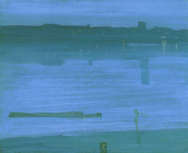 |
Blue is the coolest and most calming of all the colors. As the color of the sky, it has been used since ancient times to represent heaven. In classical mythology, blue was the color associated with the gods, Venus and Jupiter. In Christianity, it becomes the symbol of the Virgin Mary as Queen of Heaven. As the color of the ocean, it is also suggests qualities like freshness, purity and hygiene.
| |
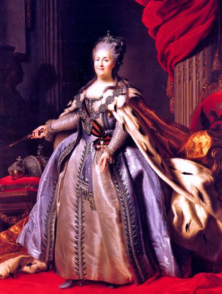 |
Purple is the color of royalty, wealth and power. In times past, purple dyes were rare and expensive. Only the rich and powerful could afford to wear clothes of this luxurious color.
| |
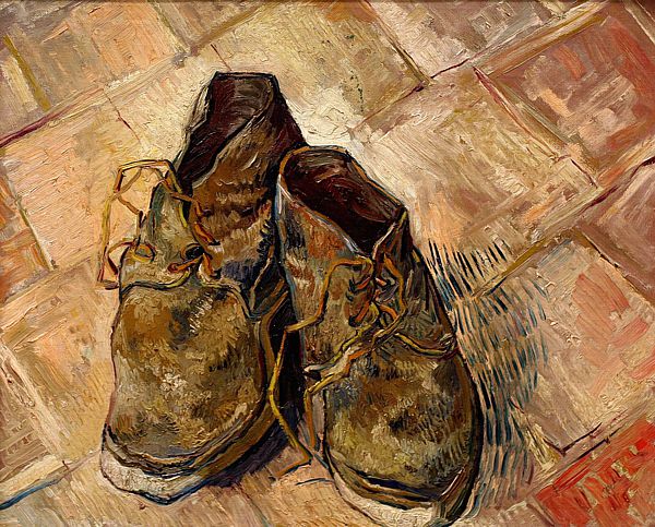 |
Brown is the color of earth, wood and stone. As such, it evokes craftsmanship and the great outdoors. It is also used to represent humility: a down to earth virtue.
| |
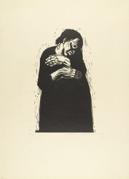 |
Black and its association with darkness is used to represent death, evil, witchcraft, fear and sorrow.
| |
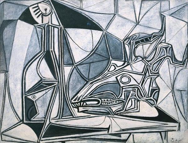 |
Grey is the natural color of some metals and stone, but it also has negative associations with the weather, boredom and old age.
| |
 |
White and its association with light is used to represent peace, purity and goodness.
|
Obviously these are all generalisations, they can depend on different countries and cultures.
Colour as emotion
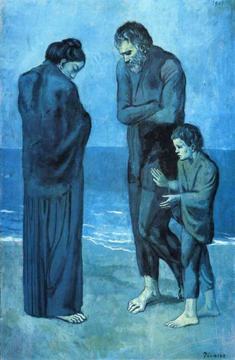
The Tragedy (1903) by Pablo Picasso
People see emotions in colours, just as they are associated with symbols. This image above Pablo Picasso is increasingly sad and depressing and cold due to the shades of blue that he has used. If this image was in red we would probably read the distance between the subjects in the painting as heated and angry. Colour can change the mood of an image.
(images from this post were sourced from http://www.artyfactory.com/color_theory/color_theory.htm)
Colours
I decided to have a play with all the different medias I had in my room for colour. These are all very vibrant colours, i do also have white and black to change the saturation
Some artists that work with colour
From: Hand to Eye, Contemporary illustration (2003).
Gary Taxali
Gary Taxali
Taxali works with Alkyds (quick-drying oils) which he paints on to masonite, ink, collage and liquid paper. He combines these with antique paper to make these effects. I really like his almost cartoon and comic affect of drawing, and that he hasn't bothered to over complicate the image with too much colour, he has just stuck with a few colours and outlines.
Julie Verhoeven
Julie Verhoeven is inspired by the "human form, character and behaviour, as well as all forms of pop culture and especially music". She uses pen, pencil, paintbrush and photocopier to create her work. I like her work, there's not much colour, but it just makes the image complete and look finished.
Jo Ratcliffe
This first image is the type that I have previously been very influenced it. I am always drawn towards perfectly mastered and finished line work. Jo Ratcliffe simply finished this above image off with a small amount of colour.
Jo uses pens, pencils, paint, psray paint, and a computer to make her work. She refers to her own kind of work as "Nouveaudellic mind collage". I really like that she doesn't over do the image with colour, she is still very much about the line work and textures.
20.10.2011
Today was tutorial day. Here are my notes-
- Explore how colour works, colour theory, UNDERSTAND colour.
- Different processes of putting colour down. What's available? Let the colour drive the work
- Express emotion in colour
- Start working with a limited palate
- MOVE OUT OF COMFORT ZONE!
Matts notes-
- Keep asking questions of your results.
- Research colour ways and palates
- google - "How colour works in comics and illustration"
- How are these skills helping you to be 'strategic' in your Visual Communication.
So basically stop seeing everything with a black outline and a white background. There was a really positive thing that Graham said to me (although it was meant as a criticism I'm going to take it as a complement), he said that my drawings are too good that they distract from and colour used. He basically wants me to stop thinking about the image that I am making and start considering how moods and images can be made from colour. But he thinks I'm a good drawer so that made me happy :)
Wednesday, 19 October 2011
Today!
Today has been a really successful day. I feel that I have managed my time well and done a lot of work. While I was in the print room instead of waiting for my processes I started a new process. This meant that I had something to do all day, so instead of just making a couple of aquatinted etches (as I did last time) I have made etchings, lino print and mono prints and uploaded it all to my blog! This is very unlike me, I normally do a lot of work but not this efficently!
My final A4 etching plate!
As I was in the print room for so long today I thought I would get my etching plate done too!
I decided to aquatint the plate after all, even though this is a long process. I'm going to aquatint because I want the inner of the tree to be black, and aquatinting will do this neatly.
This is my first print. It was so hard to clean all the ink off it! I am so glad that I chose A4 instead on A3 as that would of taken soooo much longer. The whole point of the aquatinting was to make the area behind the owl completely black, as you can see this has failed. I left it in the etching tank for 16minutes total, which should of been enough. Roger says that I should re aquatint the plate and etch that section for another 15minutes. I'm not sure if I'm going to do this but I might, as then I can colour the image with tissue again. I shall she how much time I have left!
For this print I rubbed less of the black off of the middle so that it stayed dark. It is still annoying how un even it is though, as the whole point of a print is the perfect textures.
Lino Printing
After my Mono printing today I went on to do Lino printing. The same ink is used so it makes sense to do it on the same day. I decided to make prints of the same owl. however cutting this out onto the lino was much harder than cutting it out on paper!
My first one went horrifically wrong. The tools we used to remove the lino were blunt, so I kept slipping and ruining my tile. Luckily they said I could use this one as a test. The process of Lino printing works the same as aquatinting, you have to think backwards. Anything you want to remain white cut out first, then layer it up from light to dark.
This is my Lino mid process, I have already printed the yellow ink and have prepared it for the red. So far two different layers of lino have been cut out. I then cut out a lot more of the tile so that I would be left with just a black outline. This was really tricky, and of course as it is me I managed to harm myself with the blunt tool :( Sarah gave me a plaster though so it was all ok!
When I tried to align the first and second print for this one they went wrong. I couldn't understand why as I had used the marks perfectly.
Again for this one I used the marks perfectly but this print was aligned wrongly but the other way. I finally realised with the help of Sarah that the alignment marks weren't even, so even though my work was aligned it wasn't central.
These three are all correctly aligned :) The image above I really like, the ink was applied very thinly and has made the red and yellow less bright (this looks better in real life, the photo isn't very good)
I am really really happy with all of these mono prints. The process is really easy once you get your head around the fact that everything is done backwards. ('The backwards man, the backwards man, I can go backwards as fast as you can')
Mono Print Tiles
Sarah warned us that sometimes our tiles for mono printing will look much better than the end print. This happened a lot with me! And when I wasn't covered in ink I managed to take a photo. I have also decided to keep my plate with it's final print still on it. Aparently it will take about a week to dry but that's ok as it can go on here :)
I really like this one. There are left over branch imprints on the background and there seems to be a large white haze around the owl itself.
This is my final print tile which I kept. I really like the textures that get caught up in the plate, unfortunately the ink is too thin to transfer into the paper, but it makes a good affect on here.
Mono Print
So today I woke up at the horrific time of 8am! So that I could go down to the print rooms today and do the Lino and Mono printing inductions. I have done these processes before, and I honestly think the guys down their might be starting to get sick of me, but I thought this would be a good opportunity to remember the process and experiment with some colour!
These are the outline cuts of the shapes that I used to make my prints. They were easily made I just cut out of different papers. you can also put small ideas into the press (anything on a couple of millimetres thick)
This was my first print. I wasn't expecting much from this, I just wanted my shapes to pick up lots of ink, so that for my next ones I could use them as colours. I decided to draw cut out one of my owls on cartridge paper, this paper is quite thick so it should make an impression on the print. I then just printed some branches, hoping they would layer up and thicken out as the prints layer up.
I am really happy with this print, you get the sligh impression of a brach with different shaded leaves falling from it. I also like that the impression of the owl from the last print has stayed leaving an outline. The print of the owl in the foreground has also got a white outline around it because of the thickness of the cartridge.
This is just a waste piece of newsprint that I decided to keep. I had used the white ink over the coloured plate and had to roll off the excess so the next person didn't ruin their print with my owl. But I quite like how it has perfectly printed.
Subscribe to:
Comments (Atom)


